Quilting is an art form that combines creativity, precision, and a keen eye for color coordination. One of the most crucial aspects of quilting is selecting the fabric colors.
The colors you choose can make or break the overall look and feel of your quilt. In this comprehensive guide, we will delve deep into the intricacies of choosing fabric colors for quilts, helping you create stunning and visually captivating masterpieces.
Understanding Color Theory
Before delving into the process of selecting fabric colors for your quilt, it’s essential to have a basic understanding of color theory. Color theory encompasses the principles of how colors interact with each other and how they can be combined to create visually appealing compositions.
Color Wheel for Quilting Fabrics
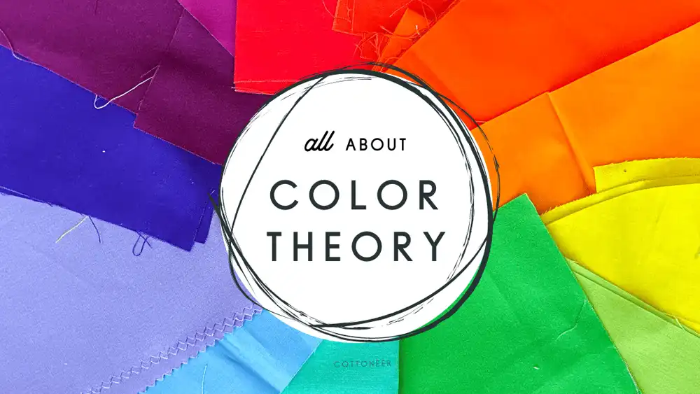
The Color Wheel Fabric is a concept derived from color theory, which serves as a fundamental tool for artists, designers, and quilters alike. It consists of a circular diagram that showcases the relationships between colors.
In the context of quilting, the Color Wheel Fabric helps quilters understand how different fabric colors interact with each other and how they can be combined harmoniously to achieve desired visual effects in their quilts.
The Color Wheel Fabric typically includes primary colors (red, blue, and yellow), secondary colors (orange, green, and purple), and tertiary colors (which are formed by mixing primary and secondary colors). These colors are arranged systematically around the wheel, illustrating their relationships and providing a visual reference for color selection.
Quilters can use the Color Wheel Fabric to create various color harmonies, such as complementary, analogous, and triadic schemes, by selecting colors that are positioned adjacent to each other or opposite each other on the wheel.
By understanding the principles of the Color Wheel Fabric, quilters can make informed decisions when choosing fabric colors for their quilts, ensuring a cohesive and visually pleasing composition that reflects their artistic vision.
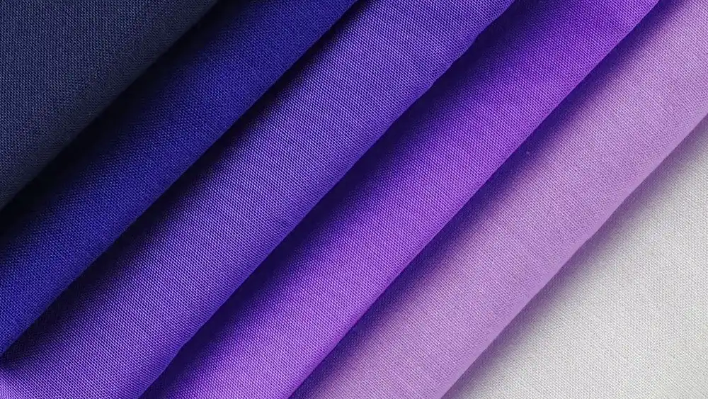
Color Harmony Fabric
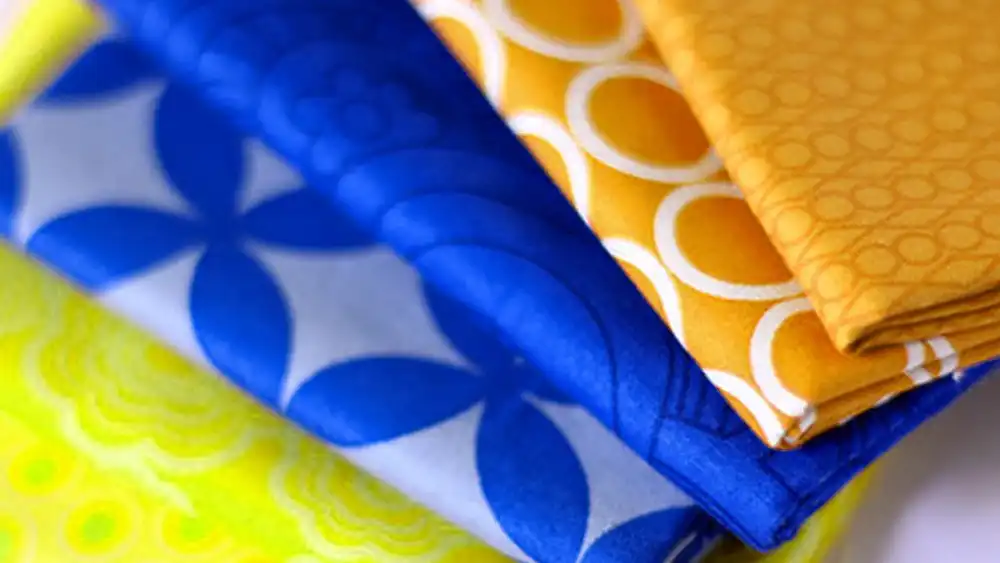
Color harmony in fabric selection is an essential aspect of quilting that involves creating visually pleasing combinations of fabric colors. Understanding color harmony allows quilters to achieve balanced and cohesive designs in their quilts.
When applying color harmony principles to fabric selection for quilting, quilters should consider the overall mood and theme of their quilt, as well as the desired visual impact. Experimenting with different color harmonies allows quilters to unleash their creativity and create quilts that are not only visually stunning but also emotionally resonant.
Factors to Consider When Choosing Fabric Colors
When selecting fabric colors for your quilt, several factors come into play. Consider the following aspects to ensure your quilt achieves the desired aesthetic:
Theme or Inspiration
Start by identifying the theme or inspiration behind your quilt. Whether it’s nature, seasons, or a specific motif, your fabric colors should reflect and enhance the theme. For example, if your quilt is inspired by spring, opt for pastel shades and floral prints.
Contrast
Contrast is key to creating visual interest in your quilt. Experiment with light and dark fabric colors to achieve optimal contrast. Bold contrasts can highlight specific elements of your quilt, while subtle contrasts create depth and dimension.
Mood and Emotion
Colors evoke emotions and set the mood of your quilt. Warm colors like reds, oranges, and yellows exude energy and vibrancy, while cool colors like blues and greens evoke calmness and tranquility. Consider the mood you want to convey and choose fabric colors accordingly.
Fabric Prints and Patterns
Incorporating a variety of fabric prints and patterns adds texture and complexity to your quilt. Mix florals, stripes, solids, and geometric prints to create visual interest and depth. Be mindful of scale and proportion when combining different prints to ensure a harmonious composition.
Personal Preference
Ultimately, your personal preference plays a significant role in selecting fabric colors for your quilt. Trust your instincts and choose colors that resonate with you. Your quilt is a reflection of your creativity and individuality, so embrace colors that bring you joy and inspiration.
How to Pick Fabric Colors for a Quilt
Selecting fabric colors for a quilt is a creative process that involves careful consideration of various factors to achieve the desired aesthetic and visual impact. Here’s a step-by-step guide on how to pick fabric colors for your quilt:
Define the Theme or Inspiration: Start by identifying the theme or inspiration behind your quilt. Whether it’s nature, seasons, geometric patterns, or a specific motif, having a clear theme will guide your fabric color choices and ensure coherence in your design.
Consider the Mood and Emotion: Colors evoke emotions and set the mood of your quilt. Decide on the mood you want to convey—whether it’s warmth, tranquility, playfulness, or sophistication—and choose fabric colors that align with that mood. Warm colors like reds, oranges, and yellows exude energy, while cool colors like blues and greens evoke calmness.
Explore Color Theory: Familiarize yourself with the basics of color theory, including the color wheel and color harmonies. Understand how different colors interact with each other and how they can be combined to create visually appealing compositions. Experiment with complementary, analogous, or triadic color schemes to achieve balance and harmony in your quilt.
Start with a Focal Point: Choose a focal point fabric that serves as the centerpiece of your quilt. This fabric can feature bold colors, intricate patterns, or a thematic motif that captures attention and sets the tone for the rest of the design.
Build a Color Palette: Once you have your focal point fabric, build a cohesive color palette around it. Select fabric colors that complement and enhance the colors in your focal fabric. Aim for a balance of light and dark tones, as well as varying degrees of saturation, to create depth and visual interest.
Consider Contrast: Experiment with different levels of contrast to add drama and dimension to your quilt. Pair light and dark fabric colors to create bold contrasts that highlight specific elements of your design. Alternatively, opt for subtle contrasts to achieve a softer, more nuanced look.
Incorporate Texture and Pattern: Don’t limit yourself to solid colors—incorporate a variety of fabric textures and patterns into your quilt. Mix florals, stripes, plaids, and geometrics to add visual texture and complexity. Be mindful of scale and proportion when combining different prints to ensure a harmonious composition.
Trust Your Instincts: Ultimately, quilting is a creative endeavor, and there are no strict rules when it comes to selecting fabric colors. Trust your instincts and choose colors that resonate with you personally. Your quilt is a reflection of your unique style and creativity, so embrace colors that inspire you and spark joy.
By following these steps and allowing your creativity to flourish, you can confidently pick fabric colors for your quilt and create a masterpiece that reflects your artistic vision and passion for quilting.
Tips for Choosing Fabric Colors
Now that you have a solid understanding of the fundamentals, here are some practical tips to guide you through the process of selecting fabric colors for your quilt:
Start with a focal point
Begin by selecting a focal point fabric that serves as the centerpiece of your quilt. Choose a fabric with bold colors or striking patterns that capture attention and set the tone for the rest of the quilt.
Build around a color palette
Create a cohesive color palette by selecting fabric colors that complement and enhance each other. Choose a dominant color and incorporate secondary and accent colors to create depth and balance.
Consider the quilt’s purpose
Think about the intended use of your quilt when selecting fabric colors. For a baby quilt, opt for soft pastels or playful prints, while a quilt for a modern home may feature bold, contemporary colors.
Don’t be afraid to experiment
Quilting is a creative endeavor, so don’t be afraid to step outside your comfort zone and experiment with unconventional fabric colors. Play with unexpected color combinations and let your imagination run wild.
Seek inspiration
Draw inspiration from nature, art, fashion, and everyday life. Take cues from your surroundings and incorporate elements that resonate with you. Inspiration can strike anywhere, so stay open to new ideas and possibilities.
Quilt Fabric by Color
When searching for the perfect fabric to bring your quilting projects to life, consider the vibrant and versatile options available. Whether you’re drawn to the soothing allure of teal, the whimsical charm of watercolor prints, the bold energy of bright colors, the rich beauty of glorious hues, or the playful elegance of multi-colored stripes, there’s a fabric to suit every style and vision.
Teal Colored Quilting Fabric:
Teal is a timeless hue that effortlessly blends sophistication with tranquility. Look for quilting fabric in varying shades of teal, from deep ocean tones to soft aquamarines. Teal adds a touch of elegance and depth to any quilt, whether used as a focal point or as part of a harmonious color palette.
Watercolor Quilt Fabric:
Embrace the enchanting beauty of watercolor prints in your quilting projects. Watercolor fabrics feature dreamy washes of color reminiscent of a painting, adding a whimsical and artistic flair to your quilts. Incorporate watercolor fabrics into your designs to create soft, ethereal effects and evoke a sense of serenity and imagination.
Bright Colored Quilt Fabric:
Make a bold statement with bright colored quilt fabric that exudes energy and vibrancy. Choose fabrics in bold hues such as electric blues, fiery oranges, sunny yellows, and vibrant pinks to infuse your quilts with youthful exuberance and cheerful charm. Bright colors are perfect for adding a pop of excitement to any quilt design.
Glorious Color Quilt Fabric:
Revel in the luxurious beauty of glorious color quilt fabric that dazzles the senses and captivates the imagination. Explore fabrics in rich jewel tones like ruby reds, emerald greens, sapphire blues, and amethyst purples to add a touch of opulence and sophistication to your quilts. Glorious colors bring warmth, depth, and elegance to any quilt creation.
Multi-Colored Striped Quilting Fabric:
Add a playful touch to your quilts with multi-colored striped quilting fabric that celebrates the joy of color and pattern. Choose fabrics featuring bold, vibrant stripes in a kaleidoscope of hues to create dynamic and eye-catching designs. Multi-colored stripes inject personality and whimsy into your quilts, making them stand out with charm and character.
Whether you’re drawn to the serene allure of teal, the artistic beauty of watercolor prints, the lively energy of bright colors, the sumptuous richness of glorious hues, or the playful elegance of multi-colored stripes, there’s a world of possibilities awaiting you in the realm of quilting fabric. Let your creativity soar as you explore these captivating options and bring your quilting visions to life with color and style.
Conclusion
Choosing fabric colors for your quilt is a highly personal and creative process. By understanding the principles of color theory, considering various factors, and following practical tips, you can create quilts that are not only visually stunning but also deeply meaningful.